Three reasons why your next big thing will fail...
(and three ways to make sure it doesn't)
In technology businesses, the pressure to innovate is constant. It’s a high stakes game with billions of dollars of revenue on the table. So how is it that we still see high profile failures, even from the world’s biggest brands? Below, I set out my three hypotheses for why product launches fail – and three things to do to improve your chances of success.
Why we fail
1. Just because you can, doesn’t mean you should…
In engineering led businesses, sometimes we lose sight of who we’re solving problems for.
The desire to create something, anything truly ground-breaking can overpower other considerations. In situations like this, user insights often aren’t considered until the big idea has been solidified, prototypes made and the whole mess is handed to marketing under the guise of being ‘the next sure-fire win’.
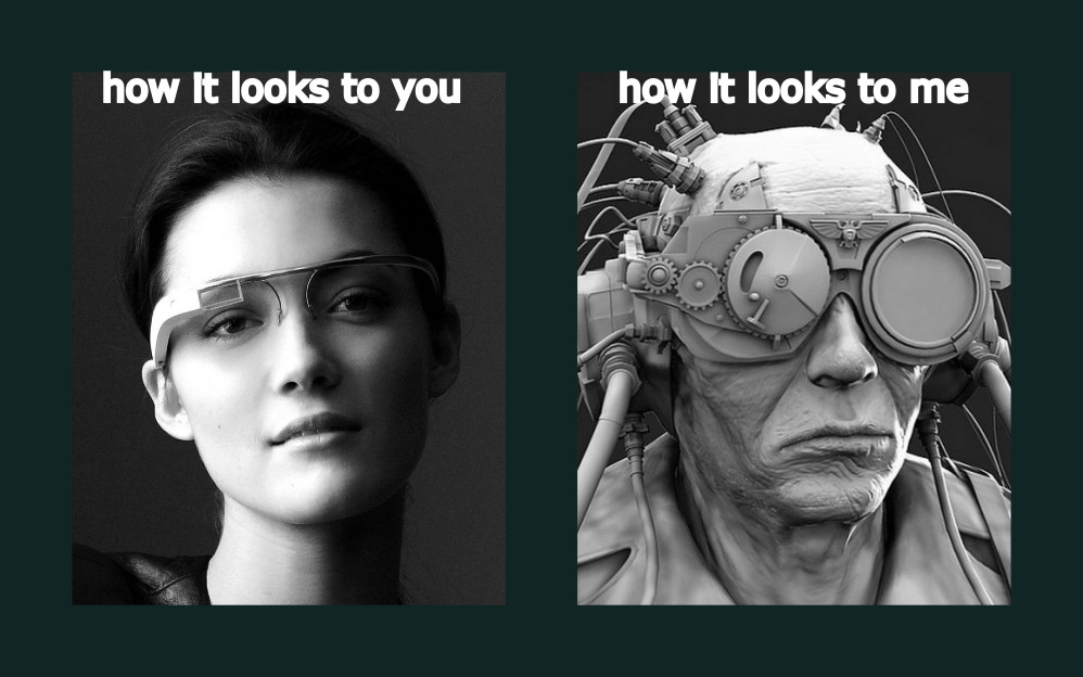
Take Google Glass
Launched as a prototype in 2013, and publicly in 2014, it was celebrated as the ‘future of technology’ and a ‘game-changing product’. Google did a fantastic job marrying hardware and software and generating excitement around it. But they missed an important step in the process: identifying and leveraging powerful user insights to not only refine Glass, but also make a better business decision around its launch. Maybe Glass would never have hit the shelves if Google had known the user backlash that it would generate.
“Has a product ever provoked as much hostility before even hitting the market as Google’s geek specs are generating? There’s something special about the eyes.”
Brian Bergstein, MIT Technology Review

And therein lies a powerful insight: The eyes are the windows to our soul. And what others see about us is just as important as what we see when looking through Glass.
Sure, the commercial failure of Glass was by no means one-dimensional, but it’s easy to see in hindsight that knowing the user’s attitudes and needs ahead of time might’ve set Google up for success.
Glass didn’t fail because of Google’s engineering, or a lack of a real use case for this product. In fact, Glass has gone on to prove very useful in some enterprise / B2B settings, which makes total sense.
Glass failed to connect with consumers because insights around primary user tensions weren’t identified and addressed early enough in the go-to-market process. Without tension, what are you solving for, and what are you proposing a solution for?
2. Failing to design with the whole experience in mind
Great features come in sets. They work together, adding up to a transformative, ownable and unique customer experience. Brand infuses that experience with emotional value, creating deeper, more meaningful connections between the user and product. Done well, product and service features become a seamless extension of user behavior. They narrow the gap between the brand promise and the reality of delivery. They delight you just enough to make a brand promise believable.
But even transformative features are not enough on their own…
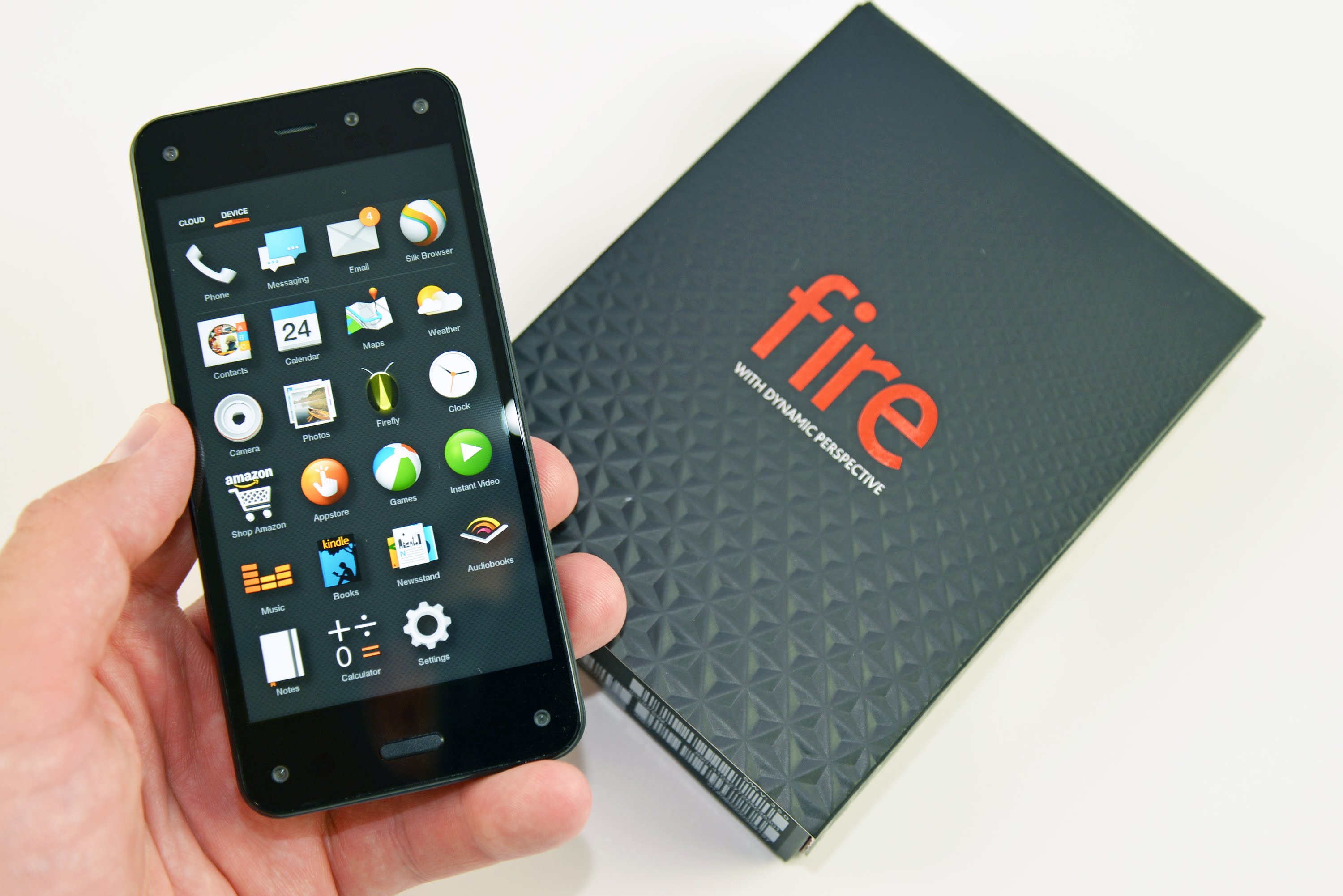
Take the Amazon Fire phone

Remember this phone? Neither do I.
Creating a smartphone that works and looks good has never been easy. But lots of companies have figured those parts out.
The challenge, especially when launching something ‘new’ into an established category, is to make adoption as easy and as simple as possible. It’s different when you’re creating a category – if you’re first out of the blocks you can establish the ground rules – Amazon’s done this successfully before, most recently with the Echo.
But when you’re late to the party, as Amazon was here, you really need to understand the ways in which users already interact with the category.
Apple and Google focused on the ecosystem – they weren’t in the smartphone business, they were in the experience business. Without the iOS and Android ecosystems, would either company be a serious player in the market today?
Faced with the competition’s overwhelming market share, Amazon went in a different direction with the Fire phone. Instead of thinking user and ecosystem first, it touted two ‘differentiating’ features, 3D graphics, accomplished with the help of four front-facing cameras, and Firefly, a function that allowed people to scan and identify thousands of items, including products, songs, and barcodes.
But there was a problem. Users didn’t care about either of those features. Amazon hoped that its loyal Prime user base would fall naturally into this product, but consumers rarely fall naturally into anything.

Fire failed because Amazon focused on the individual benefits of each feature, rather than considering the user experience as a whole.
3. You’re telling users to change their behavior, not showing them why…
Demonstrate, don’t state. People (users) are fundamentally lazy. Don’t make the mistake of thinking that just because you’ve told people there’s a good reason to do something that they’ll follow through and do it…
As we’ve established in the Fire case, in mature categories, behaviors have already been formed. Over time, shortcuts have replaced conscious thoughts. Instinct has taken over. So asking users to learn a new operating system, integrate new, unfamiliar features into their already busy lives is always going to be a stretch.
Take Windows 8

Microsoft had good evidence that users were using the Start menu less and less. Telemetry had told them users were pinning apps to the taskbar. They also had a commercial imperative to develop an interface and experience that integrated touchscreens, bridging the gap between the phone, the laptop and the desktop.
So, at launch, they junked the start menu. The Metro interface appeared. They forced behavior change onto their user base. The arrogance was breath-taking. They made the assumption that their enormous corporate user base would simply accept that the radical change and modify their behavior to fit in with Microsoft’s vision of the future.
Instead, corporate clients delayed switching to Windows 8. Users rebelled. They refused to upgrade. Many, still on Windows XP after the Vista debacle, stuck with what they knew. Microsoft doubled down. They refused to reinstate Start. Third-party apps appeared to give users what they wanted. Guides appeared on Lifehacker, expressly designed to help users circumvent the Metro interface.
Three long years later, and Microsoft admitted defeat. Disastrous sales figures and an angry user base had won out. Start was back.

Windows 8 failed because user insight – and the knowledge of how to listen to it, process it and value it – was siloed inside Microsoft’s Marketing department. Product and technical teams had never been trained to interpret user behavior. The silos that had built up in the organization meant that empathy – crucial in product design – was absent.
How to succeed
Developing a winning product requires not thinking about the product.
Instead, what you must do is think about the entire user experience, from the idea to research and evaluate, to shopping, to purchase and post-purchase support. You also must think about what users will feel throughout these different parts of the journey.
The toughest part will be figuring out what’s important and where to prioritize your thinking and resources before you make your bet.
Three ways to win
1. Start with the user
Easy to say, hard to do – but CLEAR’s Growth Map™ is our solution. Whether you’re launching a new product or looking to do better with what you’ve already got, our solution brings multiple lenses into a best-in-class segmentation of your addressable market. It arms you and your team with both a functional and an emotional view of your biggest commercial opportunities.
2. Consider the whole experience
And make sure each feature adds value to the experience and brand. CLEAR’s Experience Helix™ was founded on the principle that getting the product right is just half the battle. It’s never been more important to get user needs right and articulate the benefits in a way that only your brand can own. We developed the Experience Helix as a user experience and consumer experience optimization approach so that you know where and how to focus at every step of the user journey.
3. Train your organization to understand and empathize with your customers
Make it everyone’s responsibility. Recognize that marketing cannot (and should not) be the only voice considering the customer. We developed Insight Generation Training to empower cross-functional teams from across organizations with customer knowledge – and to give them the tools and techniques to harness it. Designed to coach marketing and R&D teams through a step by step process of using data and observations to crystallize an actionable consumer insight, IGT has the added benefit of helping to elevate the role of marketing teams by illustrating why businesses should involve them early and often in the development of products.
CLEAR uses these approaches to help some of the world’s biggest tech brands succeed where others fail.